Flow Maps

In the previous section, End User Monitoring helped us identify the 5 web pages associated with the loan approval process that showed high end user response times. We also confirmed that the high response times were directly related to the backend services supporting the browser based frontend. Now lets take a deeper dive into the backend components and services related to the loan approval process.
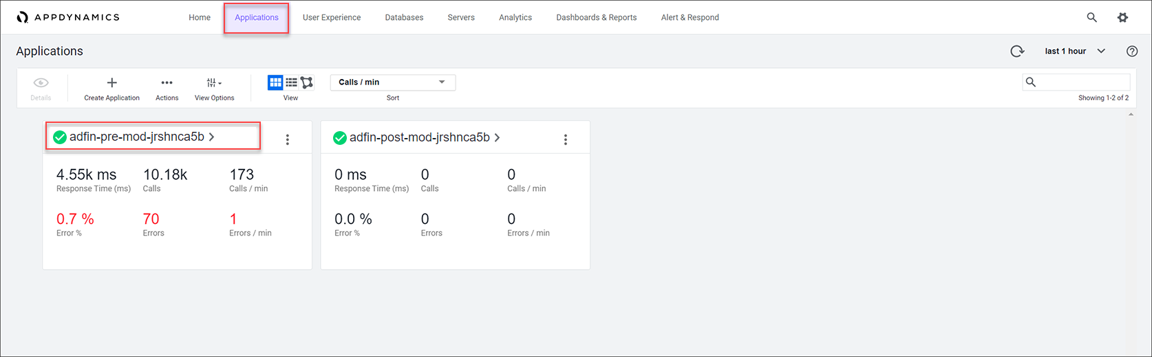
Navigate to the APM Application
Let’s start by finding the pre-modernized version of the AD Financial APM (App Performance Monitoring) application and open it to investigate the flow map.
Click on the Applications tab on the top menu, you should see the application named like adfin-pre-mod-<your_lab_user_name>
Click on the application name to drill into the flow map view for the application.
Application Level Flow Map
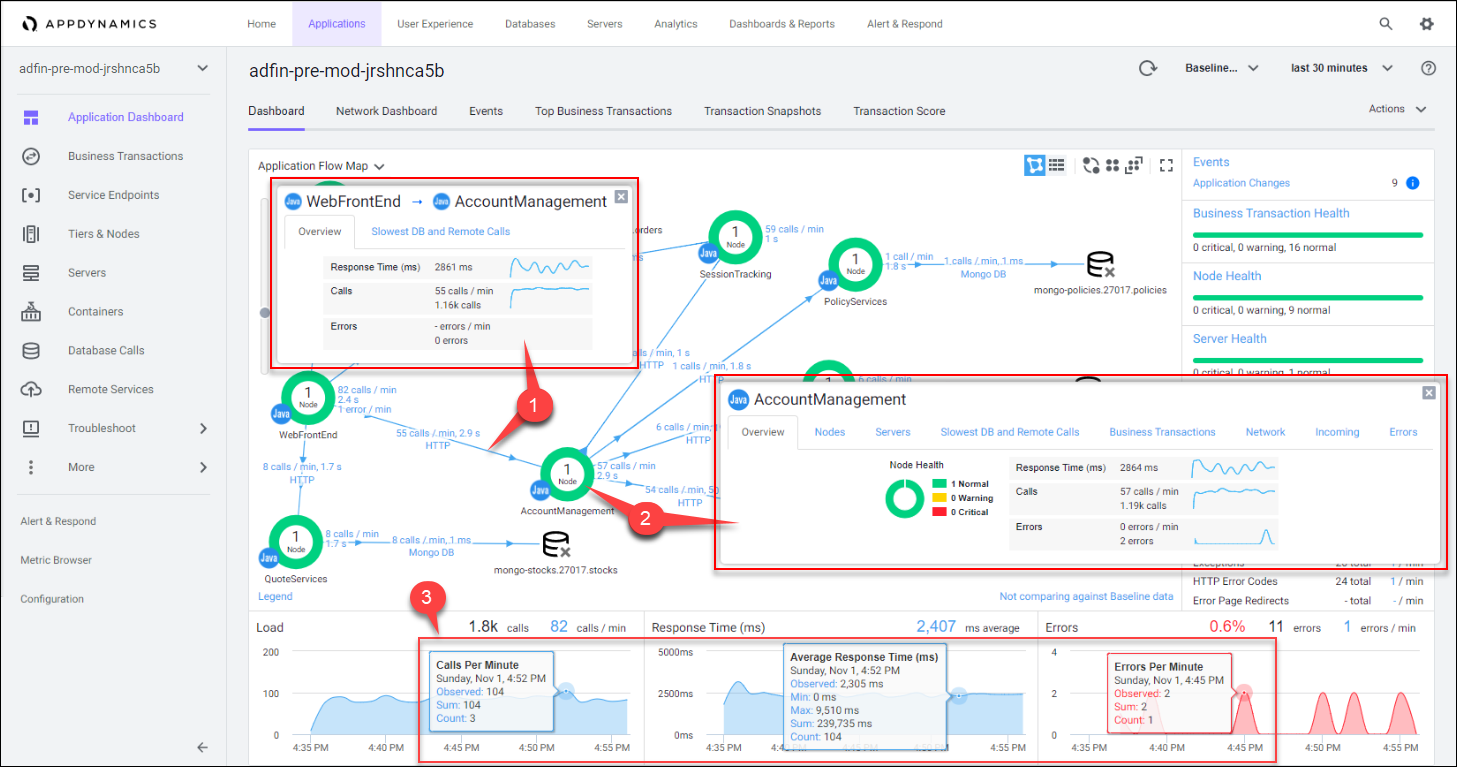
When you open the flow map for the application, you see all the application components appear like in the image below. Flow maps present a dynamic visual topology of the components and activities of your monitored application environment in direct context of the time frame you have selected.
AppDynamics APM agents automatically discover the components, frameworks, services, and dependencies that make up the application. Using intelligent automatic detection, agents collect application data and metrics to build flow maps. AppDynamics automatically captures and scores every transaction.
You will notice the layout of the icons on the flow map in your lab looks more like the first image below than the second image.
1 . Explore the automatic layout options highlighted on the top right.
2 . Adjust the zoom level of the flow map using the slider on the left.
You can experiment with manually rearranging the icons on the flow map to your desired position. Left-click (single-click) and drag each icon to place it where you want to.

Key Features
Now let’s look at some of the key features found on the flow map.
1 . Change the time frame selector to see the state of the application at that time.
- You can choose from the default time frames defined (going back a full year).
- You can also select the exact start and end time for a custom time frame.
2 . Health Rule Violations, Node Health issues, and the health of the Business Transactions will always show up in this area for the time frame you have selected.
- You can click on the links available here to drill down to the details.
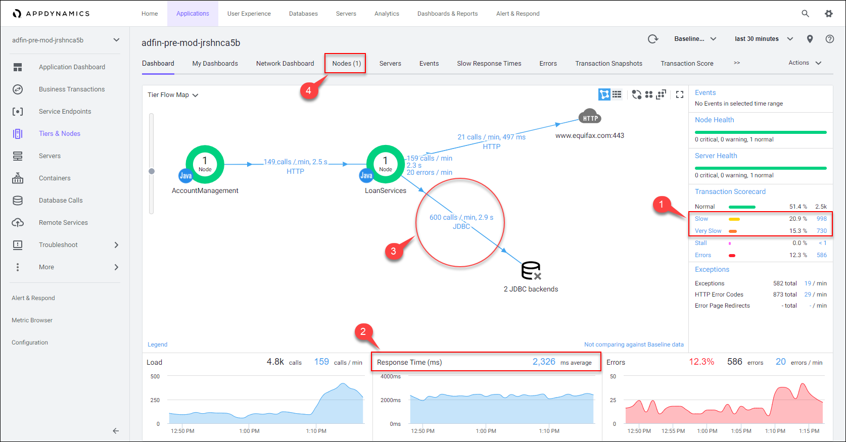
3 . The Transaction Scorecard shows you the number and percentage of transactions that are normal, slow, very slow, stalled, and have errors.
- The scorecard also gives you the high level categories of exception types. You can click on the links available here to drill down to the details.
4 . The circles you see are service Tiers that represent a group of application Nodes that perform the same function.
- The number of Nodes inside the circle represent the number of service instances running within the Tier.
5 . Flow lines represent connections between components on the flow map.
- The numbers above the flow lines indicate the calls made per minute to the tier and the average time taken for the request to be serviced, the round-trip time for the request.
6 . The three charts at the bottom of the dashboard show the time series for Load, Response Time, and Errors.
Notice on callout # 5 that the Loan Services Tier is showing high response times for Database calls ( ~4 seconds on average ).

The Flow Map also gives you summary details within the context of the time frame you have selected for:
- The response time:
- for the whole application
- for each service
- between each service
- to each dependency
- The calls per minute:
- for the whole application
- for each service
- between each service
- to each dependency
- The errors per minute:
- for the whole application
- for each service
- between each service
- to each dependency
1 . Left-click (single-click) on any of the blue lines connecting the different application components to bring up an overview of the interactions between the two components.
2 . Left-click (single-click) within the colored ring of a Tier to bring up detailed information about that Tier while remaining on the Flow Map.
3 . Hover over the time series on one of the three charts at the bottom of the dashboard (Load, Response Time, Errors) to see the detail of the recorded metrics.
Other Flow Map Views
The Flow Map view is also available for many levels and components within the application such as:
- Tiers
- Nodes
- Business Transactions
- Database Calls
- Remote Services
1 . We can see that the AccountManagement Tier has a potential latency issue with a 3.6 second response time.
2 . However, if we look at the response times of its related downstream calls, we see that the LoanServices Tier makes up the largest part of the latency, having an average response time of 2.7 seconds. - From the main application Flow Map, left-click (double-click) within the colored ring of the LoanServices Tier to bring up the Flow Map for that Tier

Once you’re in the Tier level Flow Map, you can see that the view has changed, showing only the related aspects of the LoanServices Tier. Notice that the other entities on the Flow Map are the ones directly interacting with the Tier.
1 . Notice that the Transaction Score Card shows this Service Tier has a significant number of slow and very slow transactions.
2 . Notice that the Average Response Time is fairly high for this Service Tier.
3 . We can see that the database calls make up the largest part of the latency.
4 . You can explore the Node level Flow Map by drilling in here.
You can read more about Flow Maps here
Here’s the Advantage
- Flow Maps give you a real-time topological view of all the application components, services, and dependencies, and ..
- It’s easy to see the Load, Response Times, and Error Rates, for each of these entities, at a glance.
- Flow Maps make it easy to drill down into the application components for deeper, more fine grained visiblilty.
- Having that current, up to date, understaning of the complete application topology and its performance aspects, helps your team construct a solid plan for a successful modernization project.
All Flow Map dashboards are provided OOTB and the content they contain is real-time, dynamic, and reflects the data gathered from any of the AppDynamics APM Agents ( Java, .Net, Node.js, PHP, Python, Go Lang, SAP, C/C++, Apache Web Server, IBM Integration Bus, and AWS Lambda )
Takeaways
- The application Flow Map helped us identify a potential latency issue in the AccountManagement tier
- We could see from the Flow Map that most of the latency was related to the LoanServices tier
- When we drilled into the LoanServices tier Flow Map, it was evident that most of the latency was database related
Next
In the next section we’ll take a deeper dive into the performance issues we’ve seen in the LoanServices Tier to find the key Business Transactions involved so Nathan and his team can prioritize their modernization efforts.